But still - the sense of event and importance! I have always cherished it. Especially the old version where Te Deum seemed to go on forever and a day, and where the recieving country showed its logo first before changing for the logo of the broadcaster in question.
SVT always had a pretty plain and unspectacular version of the Eurovision ident, and this is what it looked like.

Some other countries made more spaced out versions of it, and here are a few of my personal favourites:

This one was perhaps never used during any EBU broadcast, I think it was designed exclusively for the 1992 Yugoslav national final. But it looks very nice and colourful.
This one was used by Swiss television to open the 1989 ESC for Lausanne, very stylish and clean cut.

Austrian broadcaster ORF sported this very space age version in the late 70's / early 80's and I find it breathtaking (in a generally positive sense).

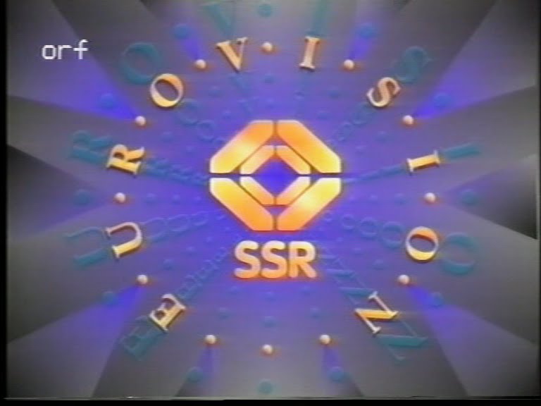
And this is how ORF designed their Eurovision ident in the late 80's / early 90's. Also most lavish and not as old-fashioned as the old SVT version.

This is my all time favourite, the very progressive logo made by RTBF to suit the opening film, beginning with Tintin's space rocket heading from the moon back to earth.
Is there anybody else out there paying attention to things like these...?